A simple way to take control of your time.
Day One 2 Review
The developers behind my favourite journalling app Day One have released a second version. It’s called Day One 2, and I like it rather a lot.
I’ve been testing the app for a few months now as part of the beta program for Mac and iOS.
After giving it some thought, I figured that rather than doing the typical thing and having the things I don’t like about the app at the end of the post, I’m putting them right up front. That way it’s the first thing you read, so you know what you’re getting into.
Stuff I Don’t Like - Features Removed
Day One 2 has removed some good features from Day One (Classic). It’s a completely re-written app, so I’m not surprised. I heard that the new app is using a database to store the journal data rather than the .xml files that the original Day One used.
In any case, in the process some features I liked got cut out. I’ll miss some more than others.
The Day One ‘publish’ feature is gone. I used it a total of 10 times. It seemed like a good idea, but its introduction also coincided with a dramatic reduction in me posting on social media so it never caught on for me. If you don’t remember the feature, here’s the description from the Day One website (I guess it’s still up because Day One Classic can still use it):
Publish enables you to post individual Day One entries to a beautiful webpage, then share them.
Day One 2 does still show the journal entries you have published under the filters menu (see below), but you can no longer publish from within the app.
Automatically detected tags are gone. But now you can directly set a tag using an automation app like Workflow, rather than the workaround I was using. I added a #hashtag to the text and Day One automatically detected it as I saved the entry.
The option to sync using iCloud and Dropbox has been removed in favour of the 'Day One Sync' feature. This could be huge for some people (I’ve certainly heard about it). I hope the developer considers bringing back other options - it feels a little unsafe having such personal data sitting out there with a small app development house rather than within iCloud encryption. Sure they’re less of a target, but they also have less resources to look after my stuff if there was to be an attack.
Stuff I do Like
Multiple Journals
The ability to seperate my journal into segregated journals is a nice flexibility upgrade for Day One. Visually each journal is represented in the UI by a different colour. But the separation runs deeper - each journal has its own set of tags too. There is a ‘all journals’ view where you can see everything at once, but the separation is a nice way to keep things organised.
I’m using three journals at the moment:
- my original ‘journal’. This contains my gratitude journal and random thoughts. It’s my digital diary.
- a book journal. This contains notes on the books I’m reading. I’m trying to remember more of what I read this year, so even if it’s just a few sentences capturing the key things I learnt from a book, I record it here.
- a business journal. This contains my business related journal entries.
I can see that there are plenty of other ways I could use Day One now. I could have done this using tags in the original Day One, but there’s something about the separated journals that just fits better. As a result, the app is more flexible than it was before.
Multiple Inline Photos
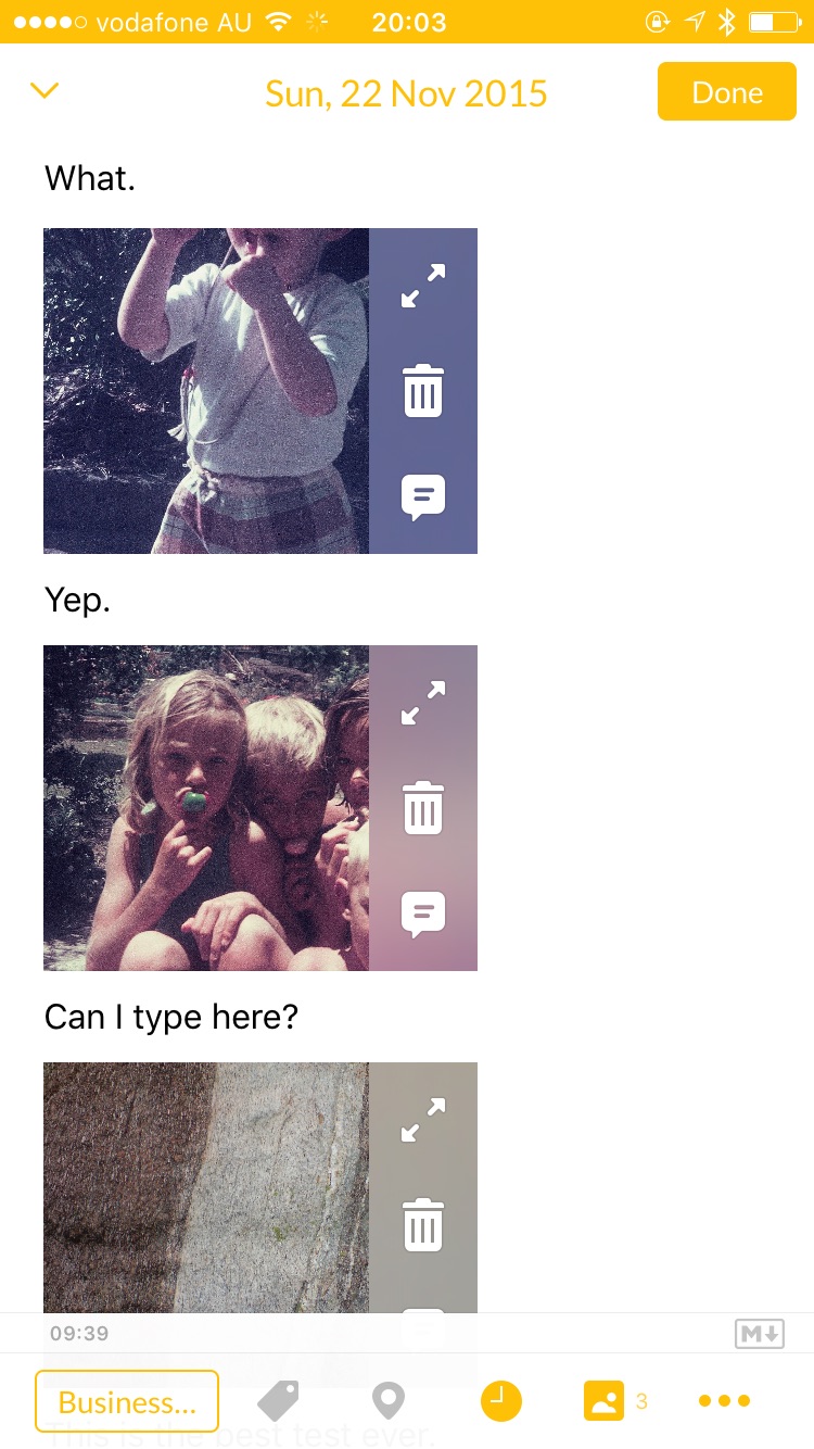
You can now attach multiple photos to a single journal entry. It’s limited to 10, which is a sensible limit if you have to have one. If you need more, simply create a new entry.
This is a test entry I made back in November.
Most interesting to me about the change is that photos can now be inserted inline with the text rather than just attached to an entry at the top. It makes your entries nicer to look at and means you can tell a story using your photos.
I imagine that people who were taking multiple photos throughout the day and sitting down to write a long entry at the end of the day were wishing for multiple photos per entry. For whatever reason, I tend to create multiple short entries throughout the day with one photo attached. I rarely waited until the end of the day to write in my journal, rather I saw it as something I’d do in the moment. In my mind, my daily reflections were seperate from photos so I never felt the need to attach any photos to those. I’d say this habit is at least partly because that’s the way Day One worked, so it’s nice to have the option now. I’ve been using Day One 2 in the beta for a while now, and I haven’t found myself using this feature.
Day One 2 uses a very similar photo view for viewing all posts containing photos. Day One 2 (left) provides all the same filtering options available on the main screen. You can filter by journal on the top left or any of the filters under the tag button on the top right. Because there are less options, Day One Classic (right) can fit more photos in the view. Would you just look at that happy puppy!
User Interface Refresh
The new user interface is clean and simple in a way that I find easier to use. Like in Day One, the main screen has two big buttons to quickly start a new entry. But the list view of entries isn’t hidden behind a menu item, they’re all right there for you. You can swipe on a journal entry to perform actions on it, like adding a tag, star, or deleting it. There is a tab bar at the bottom of the screen with buttons representing various ways to view your journal: a list view, photo grid, a map, or a calendar. Because of the way I use the app, I spend the vast majority of my time using the list view.
The Day One Classic front screen (left) has filtering functions and journal entries hidden behind this list view. Day One 2 has almost all the same options available in the tab bar, with some behind the 'tag' button on the top right.
Editing an entry from the front screen is simple.
The Day One Classic tag screen on the left. Day One 2 uses a modal tag view.
The calendar view in Day One 2. I like the way the app shows a full calendar view to scroll through and slides up a list view when I select a date.
The map view and the filter menu. You get to the filter menu by tapping the tag symbol on the top right.
I use the app mostly for adding entries. Usually the first thing I do upon opening app is tap the big plus button and start writing. If I’m using a photo, I usually add it after writing from within the journal entry screen rather than using the photo shortcut. That’s because my journal is mostly text. I’ve also been using the great Workflow app to do my daily journalling.
My primary use of the app is to enter information. But Day One 2 also brings improvments to viewing entries that I really like. To navigate between journal entries, you can swipe left or right or tap the up and down arrows at the bottom of the screen (up means go up the date ordered list, towards the newest entries and down means go down the list towards older entries). Those features together make it easier to navigate on the larger screen iPhone. You can dismiss the journal entry with a swipe down anywhere on the text, which is much better than a ‘done’ button at the top.
By moving the list view up to the main screen, the developer had to find a place for all the old journal viewing options. Some (like the photo grid) are in the tab bar at the bottom of the screen, but other options have been put into a filtering menu at the top right of the main screen. Tap on the tag symbol to bring up a filtering menu. You have the option to filter on stars, tags, years, activity, or music.
So far, Day One 2 has helped me spend more time reading my journal rather than always adding to it.
Custom Reminders
Setting custom reminders is a nice way to automate your journal. You can set up a reminder for a specific time, with a specific question to answer and pre-filled tags. I use this to remind me to write about a specific topic every day. I get the reminder, I write the entry, and it’s pre-tagged and ready to go. It’s simple, but nice.
This upgrade is a solid upgrade. The app is cleaner, faster, and allows me to interact with my journal more. I was always going to recommend this app though. I started journalling every day around a year ago, and I’m completely converted to it’s usefulness. I’ve had some of the most productive and wonderful times of my life since I started journalling. It could definitely be a coincidence, but there’s something about writing in my journal every day that has made me notice how good I’ve got it in a way that I never did before.
Day One has made my journalling habit stick, and I look forward to reaping the benefits with Day One 2.
Excited
I consider myself to be a new developer. In the last few months, I've been learning C, C# and ObjectiveC. I've still got a long way to go, but I'm sure I always will - you never really stop learning.
This weeks announcements from Apple have been exciting for me. In the last few years, Apple has consistently been iterating and making some great products. But this WWDC really felt different. They've been working on this for years, and the excitement is electrifying amongst developers. You can read about it here or here. There's a lot out there, that's only two people I follow.
This is a great time to be a new developer, I'm super excited.
Omnifocus for iPhone
I've been using Omnifocus for a year or so now. It's been a great help in my first year working full time, helping me to keep organised and in control of my work. So naturally I'm pretty excited to see what they've come up with for the next version of the iPhone software.
It'll come out tomorrow.


